Tuesday, 19 January 2010
Audience Tweaking...
After looking through my shots so far, I realised that my magazine was going to look very femine, and as when before I was looking to aim it at both boys and girls, I think i'm going to change my target audience to just girls as I don't think that boys will look at the magazine and be interested in reading it- they may immeadiately assume it's for girls.

The Photoshoot
On monday night, my friend willing to model for my photos came over to experiment with some ideas for poses and costumes. Orginally, these were just going to be test shots but as it took quite a lot of arranging to get together, we spent about three hours firstly practising and working with shots, and then taking some final ones that i'll hopefully be able to use for my double page spread and contents page. I took some in the style of the photos i'd like for my front cover but I think i'm going to experiment with different people and I still need more practise to perfect the photos for the cover. I ended up with 98 photos to work with!
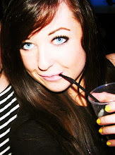
I liked using Sara for these photos as she is very photogenic with a lovely smile, and I wanted the photos on my double page spread to look fun and quirky so this was important. I'm going to edit the photos so they have a high contrast and smudge the background so that it doesn't look like it's a bedsheet (which it is!) I used to 'retro' setting on my camera to get the reddish effect and used the auto flash. My sister helped us by holding lights in the right place so that we got the right lighting...
 I love the costume for this shot, and the pose
and if I think it'd be good for my contents page
although the top of Sara's head has been cut off.
It also needs to be cropped on the right side.
 I like the soft effect this had, not as sharply
captured as the other photos, although this
could effect the continuity of my shots.
 I like this pose because it's natural and simple.
 This is one of my favourites and everybody
that i've shown it to has loved it as well. I
took the inspiration from a photo much like it I
found online whilst researching poses and recreated it.
It fits the quirky and characteristic criteria and I definately
want to use it somewhere in the magazine.
 I used the microphone to link with the topic of the magazine
because I wanted to be careful that I didn't loose focus on the
fact it's a music magazine. I like the pose because it's fun and cheeky.
 I think i'll almost definately use this shot because
it captures the kind of persona I wanted to get across- it's fun
and bubbly.
 I like this shot again because it's silly, like she's
messing around but there is something red in the
bottom right corner (?!) but I could always crop it.
 Another silly fun one :)
 I love this shot because it's a bit different to
the others and her smile looks really model-like!

This is definately my favourite shot. It's fun,
cheeky, quirky and beautiful. I think i'll definately be
using it!

Another happy smiley one.
 This is another favourite, because of the unusual pose
and I like the way the shadows of her arms look against
the background. I think when edited with a high contrast,
this could look really retro and quirky.
 This one is a little different, a bit more classy and serious
because I wanted to experiment and try out different things.
I like it because it's refreshing to have a bit of variety.
I liked using Sara for these photos as she is very photogenic with a lovely smile, and I wanted the photos on my double page spread to look fun and quirky so this was important. I'm going to edit the photos so they have a high contrast and smudge the background so that it doesn't look like it's a bedsheet (which it is!) I used to 'retro' setting on my camera to get the reddish effect and used the auto flash. My sister helped us by holding lights in the right place so that we got the right lighting...
 I love the costume for this shot, and the pose
and if I think it'd be good for my contents page
although the top of Sara's head has been cut off.
It also needs to be cropped on the right side.
 I like the soft effect this had, not as sharply
captured as the other photos, although this
could effect the continuity of my shots.
 I like this pose because it's natural and simple.
 This is one of my favourites and everybody
that i've shown it to has loved it as well. I
took the inspiration from a photo much like it I
found online whilst researching poses and recreated it.
It fits the quirky and characteristic criteria and I definately
want to use it somewhere in the magazine.
 I used the microphone to link with the topic of the magazine
because I wanted to be careful that I didn't loose focus on the
fact it's a music magazine. I like the pose because it's fun and cheeky.
 I think i'll almost definately use this shot because
it captures the kind of persona I wanted to get across- it's fun
and bubbly.
 I like this shot again because it's silly, like she's
messing around but there is something red in the
bottom right corner (?!) but I could always crop it.
 Another silly fun one :)
 I love this shot because it's a bit different to
the others and her smile looks really model-like!

This is definately my favourite shot. It's fun,
cheeky, quirky and beautiful. I think i'll definately be
using it!

Another happy smiley one.
 This is another favourite, because of the unusual pose
and I like the way the shadows of her arms look against
the background. I think when edited with a high contrast,
this could look really retro and quirky.
 This one is a little different, a bit more classy and serious
because I wanted to experiment and try out different things.
I like it because it's refreshing to have a bit of variety.
Monday, 18 January 2010
Photo Ideas
One of the main themes I am looking to use and focus on with the photos in my magazine, is the idea of having several similar photos put together to make one, like in the ELLE cover photo I posted a few blogs back, and like this:
 I aim to take as many photos as possible with my test shots so I have a lot to work and play around with, and I want to pose's to look quite natural and fun, as I want my magazine layout to look simple. The fun and quirky photographs will take out any boring feel to the pages and add some character!
These photos are a few that have given me inspiration as to what kind of poses to capture:


 I aim to take as many photos as possible with my test shots so I have a lot to work and play around with, and I want to pose's to look quite natural and fun, as I want my magazine layout to look simple. The fun and quirky photographs will take out any boring feel to the pages and add some character!
These photos are a few that have given me inspiration as to what kind of poses to capture:


Title Adjusting
I chose the name 'Tuned In' for my magazine, a play on words. Today I decided to change the magazine title to 'Tuned' because it is shorter and snappier, and still has the same clever play on words and it will look better with my simple theme!
Sunday, 17 January 2010
Sketches


These are the sketched mock-ups of what i'm hoping my magazine will look like. I am happy with the look of them but I think the contents page could do with some work as it is quite plain at the moment. I'm hoping that after some experimenting on photoshop, I can come up with something more interesting for it.
Saturday, 16 January 2010
Audience Profiling

AGE: 16-25
OCCUPATION: Student.
BACKGROUND: Quirky, different, classy.
LIKES: Fashion, live music, art, celebrity culture.
DISLIKES: Chavs, unoriginality.
AMBITIONS: Creative job, e.g. musician/designer, to travel.
MUSICAL PREFERENCE: Indie, acoustic, electro, alternative-pop.
LOOKS UP TO/IDOLISES: The Olsen twins, Fearne Cotton, Nick Grimshaw, Alex Turner.
MEDIA CONSUMER HABITS: TV- Gossip Girl, Friends, Skins. Magazines- ELLE, NME, GQ, Lula. Film Genre- comedies, thrillers, independent, romance.
Inspiration

When I was browsing the internet for ideas to add effect to my front cover to stop it looking boring, I came across this ELLE magazine cover and loved the three photos blended into one and how the magazine title sits across it without restricting the photos. I want to use something similar for my magazine cover because it looks classy and simple, but shows skill and character.
Subscribe to:
Posts (Atom)