
Pitch Feedback
The feedback has give me confidence in my idea and inspired me to do a few things different e.g. not showing enough technical skill. I'm going to concentrate on putting interesting effects on my photos and playing with layering etc to broaden and demonstrate my skill in photoshop. The suggestion of having bright colours for a 'pop fun look' definately works well and I am going to go ahead with this to make my photos even more quirky and fun. A classmate reminded me of the fact that my fonts and photos should relate back to the theme of a music magazine, so I need to be careful that I don't veer away from that with my photos.
Saturday, 16 January 2010

Tuesday, 12 January 2010
Possible Colour Schemes

I like these colour schemes because they are fairly neutral and so would appeal to both girls and boys. They're simple and the colours don't clash, as there is only one bright colour in the three.
Monday, 11 January 2010
Font Ideas
 I have decided on the name 'Tuned In' for my magazine and have been experimenting with different fonts to use for my front cover. I have come to the conclusion that I want to use something quite fun and different that looks as if it has been handwritten. I think for my masthead though that it needs to be bold, more like the bottom font than any of the others.
Tuesday, 5 January 2010
Double Page Spread Analysis
 This contents page is busy looking but also professional. I like the way selected blocks of text are in blue to stand out and it breaks up the text, along with a photo at the top. There is a seperate section on the right of the page with a different kind of feature which doesn't completely relate to the main article except from the fact that it is about new music. The main colour scheme is blue, white and black and the page looks professional and appealing.
  This magazine cover is busy and colourful, with a lot of text and equally a lot of photos. The photos are made to look as if they have been cut out and stuck on, much like a scrapbook which looks effective because it is fun and messy and laid back, capturing the tone of the article which is about gigs and parties.
This double page spread is minimalistic, black and white and simple. The text is arranged in three small collums in small text, surrounded by white and I like the spaced out effect it has. The article is in interview form which breaks it up and makes it look less like a long essay which makes it more appealing to read.
Contents Page Analysis
 This contents page is plain and simple and easy to grasp, with the red page numbers to stand out. The photo on the page is to represent a feature and the feature description and page number are next to it, setting it away from the rest to exaggerate that it is an important and main feature.
  This contents page is quite full with easy navagation as the page numbers are big and bold. There are three mini pictures on the page and one main larger photo that relates to a feature. It also has an advert type section at the bottom of the contents page advertising £2 off if you join 'Club NME'.
 I like this contents page because it is unconventional and different. The illustrations make it unique, and the set out of the contents makes it look a bit like an album cover which relates back to it being a music magazine. It still more or less keeps the colour conventions as it mainly uses pink, green, white and black and it works well.
Front Cover Analysis
 I love the simplicity of this cover and how the red background is part of the cover photo. It uses the three colour scheme (red, white and black) each colour bold and standing out against the other. The feature titles are fairly small but bold and don't get in the way of the cover shot.
  This magazine cover is quite busy looking, with lots of features on the front and two mini photos. The colour scheme of dark blue, pink and white works especially well and doesn't clash with the cover photo as is it quite a simple photo. The features, quotes and photos are sort of wonky looking which makes it look like they have just been slapped on, giving it a casual and laid back look, relating to it's target audience.
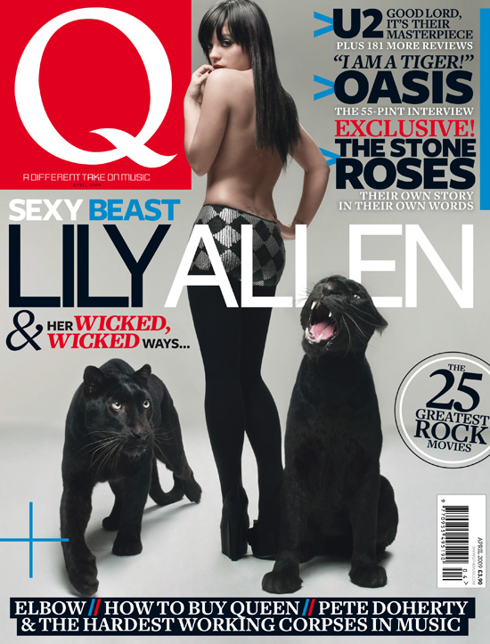 I like this magazine cover because of the simplicity of the cover photo and the page doesn't look too cluttered. It is set out orderly with the features at the top opposite the logo, and also at the bottom. I like the way certain words are made to stand out e.g 'wicked' in red. I don't like the colours used on this cover. They mainly use red, white, blue and black which breaks the three colour scheme and against the grey, it looks washed out.
Subscribe to:
Posts (Atom)