
For our print prelimary, we had to make a school magazine and we decided to base ours around fashion as it is something that we are all interested in. We wanted our magazine to look professional and not tacky. We stuck to a grey, red and white colour scheme and the same font through out. This is to make it look professional and create a familiar and iconic feel to the magazine that readers would recognise.
On our initial mock-up, we decided on our colour scheme and most of the cover stories before hand but not much else. When it came to creating the magazine cover, we decided to have all the text on the right so that the model was completely visable and so was the text. We broke this convention once though with the mast header and we put it behind the cover picture and it slightly over-lapped.
 We used these symbols on our page, inspired by GQ and Nylon magazine. They are interesting and break up the text.
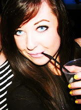
Our cover picture links in with the text because it features Ross, the fashion icon we wanted to feature an interview with and this is expressed in one of our cover stories. We edited it to have a faded out coloured look about it to add a professional smooth look to our front cover. We continued these conventions and schemes to our contents page where we featured more photos with the same sort of effect as the cover photo.
 From this task, I have learnt how to carry out professional conventions and create them in our own work. I have gained more of an understanding in photoshop and what is involved in creating a magazine cover.
0 comments:
Post a Comment