Sunday 18 April 2010

Final Finished Pieces

Saturday 17 April 2010

Preliminary

Friday 16 April 2010

GOODBYE

This is my farewell blog post as my coursework project will be over done and dusted in three hours and fifteen minutes!
I hope you, the examiner, have enjoyed looking at my research and my path of experimenting until I reached my final pieces. I have enjoyed the coursework a lot although it has often been stressful, having to rely on technology so much! But I really hope all my hard work, effort and time pays off! You can find all of my coursework under the label 'coursework', to make it easier for you to navigate around my blog

..THE END :) x

Thursday 15 April 2010

'Tuned' Evaluation

Thursday 25 March 2010

Equipment Used

Contents Page Experimenting

I have changed the middle photo on my contents page so that it was my own, as the other was just a temporary. I wanted the photo to look like a papparazzi shot to fit with the article about 'Frankie' going solo. I edited the photo to make the contrast and brightness higher so that the photo looked more professional.

Ident Placement

I have experimented with the placement of my chosen ident in the top and bottom hand corners and I think that it looks best in the bottom right because in the top left, it takes the attention away from the photos a little bit and here it fills an empty space.

Double Page Spread Experimenting


In my teacher feedback, I was adviced to experiment with the black and white effect. However I am not so sure about it and prefer the photos all in colour as it looks more like a photobooth picture which I liked the effect of.

Here I have tweaked little parts of my article to improve it, have added a line as the crease in my double page spread, added a page number in the bottom right hand corner and added the publicist name beneath the article, which was on my to-do list.

More Front Cover Improvements...

I have added the price of £3 (the average price from my market research survey that my intended audience would pay for a magazine) to the bottom right of my magazine above the barcode.

Idents

These are three ideas for my Ident. I chose the name 'buzz productions' as it is fun and quirky, and used fun and quirky fonts to go with the name. I am going to use the top one on my contents page.

Monday 22 March 2010

Market Research Questionaire Feedback

The price that came out most in my feedback was approximately £3, so this is the price at which I will price my magazine. People said that they would like to see interviews, music reviews, album recommendations, new music and tour info inside a music magazine and all these things besides album recommendations appear in my magazine :)
Almost all of my feedback suggested more photos of different people as a general improvement, so I have incorporated this into my contents page, adding two photos of two different people and I think this is better and more effective. Nearly all of my feedback suggested to change the background to white on my contents page, so I did this and definately really prefer this. Some of my feedback suggested changing my article to a regular article but I think that my page looks more interesting with the different style of article, so I am going to keep it as it is but maybe tweak the content a little.

To Do List

  • Add price
  • Experiment with black and white effect on the DPS photos
  • Include the writer name on my article
  • Make an ident

Sunday 21 March 2010

Contents Page Adjustments

I didn't like my original contents page at all and decided to almost completely change it. I think that this design looks more like a typical contents page and I prefer it a lot more. I have included more photos, which most of my feedback suggested, (the middle photo is at the moment just a tester picture and I will be taking my own as soon as possible), and I think this makes the page more interesting with more to look at. I added more pages onto my contents list to fill it out more, changed the colour of the 'contents' title and changed the background colour to white, like the double page spread and this was also something suggested in my feedback and I think it works really well.

Front Cover Improvements

I have changed the 'a day in the life of' text because I couldn't find anywhere that it would go that would make it clearer and easier to read, so I changed the text to 'meet...' and added 'a new starlette about town' at the top of the page to add more to the purpose of the cover photo, and to make the page look more filled out. I moved the barcode to the bottom of the page as this was some peer feedback I recieved and I prefer it here. I changed the heading colour and cover feature text colour to pink, the same colour as the models sunglasses and this adds more colour to the page making it look more interesting and bright and I prefer it like this.

Here I have changed some of the text to black because it is bolder than grey and this is some feedback I recieved from a teacher. I think that the grey goes better with the pink because they compliment each other, and I am not keen on how pink and black go together, so I think I will keep the text as grey.


Thursday 11 March 2010

Teacher's Feedback

The feedback I recieved from my teachers was:
  • Alter the 'a day in the life of' text to make it more clear (consider shadowing)
  • Add price of magazine
  • Consider spacing of features on the contents page
  • Colour of the speaker needs adjusting on the contents page
  • Consider a black and white effect on the double page spread (two diagonal pictures)
  • Include writer of the article

Thursday 4 March 2010

Market Research Questionaire

I will be conducting a questionaire for my target audience concerning oppinnions on my magazine and other magazines and finding out what they do and don't like.

GENERAL
1. How much would you pay for a magazine?
2. What magazine (if any) does my magazine remind you of?
3. What sort of things would you like to see inside a music magazine?
4. What improvements would you make?
FRONT COVER
1. On first look, what genre would you assume my magazine was about?
2. What do you think of my title 'Tuned'?
3. What do you like/dislike about my choice of font on the magazine cover?
4. What improvements would you suggest?
CONTENTS PAGE
1. Do you think the background colour works well or would it look better in white?
2. Does it relate to a typical contents page?
3. Do you think the subheadings work well?
4. What improvements would you suggest?
DOUBLE PAGE SPREAD
1. Do you like the idea of my article and is it well written?
2. Do you think my choice of fonts works well?
3. What do you think of the photograph layouts on the right side of my DPS?
4. What improvements would you suggest?

Monday 1 March 2010

The Soloist Articles

Times Online Article

The aricle briefly explains the plot line before going on to explain the troubles The Soloist had getting into British cinemas, as it's release was pushed back behind Revolutionary Road and Benjamin Button. The article is quite criticising of the film by saying, "There’s a cringeworthy sequence in which Wright attempts to convey just how noble and unbroken the homeless man’s spirit is by intercutting his violin playing with shots of pigeons flying over LA," and saying that the film will leave you feeling disappointed. However it continues to credit the film a bit by saying, "To be fair to the makers of The Soloist, this is a true story and they evidently felt it would be improper to depart too far from the facts." Ultimately, it concludes to say that the film 'fails'.

Tribune Blogs

This article explains how Paramount pictures had a fall in advertising budgets and so decided to move The Soloist's release date back. It also had to put back a number of other films e.g 'Defiance'.

Defamer

This article explains how The Soloist was dropped as the film to open AFI Fest and replaced with 'Doubt'. AFI Fest presents a survey of the years most significant films and would have been amazing press for the film.

Friday 26 February 2010

Class Feedback

When evaluating my own work with the mark scheme, I gave myself a high level 3. My peer level came out as a level 4. My successes seem to be the photos that I took and the colour scheme and fonts. The improvements I was given was to make the cover story text on the cover smaller so that it's easier to read, to fill the space on my contents page and use some different camera angles and experiment and also to make the background colour of the double page spread the same as my other two pages.
The general comments all semed to be positive and saying they liked my drafts! :)

Friday 12 February 2010

First Drafts


These are the cover page, contents page and double page spread that I am submitting as my drafts.

Wednesday 10 February 2010

Double Page Spread Experimenting

This is exactly what I had in mind for my double page spread. It's simply laid out, not too busy, orderly and professional looking. The photos give it the quirky edge that's important in my magazine and the sections in the article make it look less like just big blocks of text. The only problem is the top right photo on the spread looks bigger than the other photos as it is more close up, so I might try experimenting with another photo there (although I love that photo ): ) and also changing the order of the photos to find out which looks best!

In this version, I have changed the top right photo for another and I think this works better as it looks more continuous so I am happy with the result.

Sunday 7 February 2010

Contents Page Experimenting


I do like this page but I think the black and white makes it look quite boring and bland. I don't think there are enough warm colours.

I prefer the colours in this page but nothing on the page shows any proper skill which makes it boring... Also I don't think the photo in the corner works very well, but if I changed it to something like a speaker or stereo, it may work better


I like the way the contents is set out here with the features spaced out a little more and a little description underneath. I took inspiration from this. Although I think that in terms of pictures, the page still looks a little boring and there isn't enough room to fit another photo in. To fix this I would have to make my features smaller and more together to be able to fit a picture in the corner.

Of all the experimenting I have done, I feel as if this is a combined effort of all of them. I used a photo of an amp from google but before I finialise this as my draft, I need to take my own photo and edit it in the same way. I copied part of the wire of the microphone and twisted it to change the shape and pasted it next to the amp so it looks as if it is connected to the speaker, which ensures that the music theme is still prominent. I have added more features onto the page to fill it out a bit more, and also included sub-headings, which adds a bit of character and quirkiness e.g 'shh... you didn't hear it from us'. This relates to girls and gossip which is a typical stereotype, targetting the intended female audience.

Here I have taken my own photo of a speaker (couldn't find an amp) and edited it to make the colours bright and vivid. I think it looks good on the page and takes away the boring feel. I changed the font of the title to match that of my cover to make it look less 'samey' and I think it breaks the page up a bit!

Friday 5 February 2010

Front Cover Experimenting

The advice I got from my teachers and peers told me that I should use one of the close ups of my other model for my front cover because they are effective and good photos and work better than the blended photos. I decided to experiment with both models to find which I liked more, and experimented with fonts and techniques for my masthead...


I chose this photo to experiment with first as it is one of my favourites and is quirky and fun, setting an appropriate feel for my magazine. I used a music stave behind my masthead to relate back to the fact it is a music magazine and to keep this clear. Each letter of the title is wonky and out of place, like notes on a stave and I think it looks quirky fun and original!
I changed the font of the masthead to something less boring and something more characteristic and I love how this works because it's unusual and the way some of the letters are the wrong way around looks quirky. I added the text for my cover story on and I think it looks classy and quirky, a lot like this cover story technique.
I messed around with the fonts in this one and tried different ones, but I really like the ones used in the above photos so I think that I will stick to those. These covers remind me quite a lot of THESE sorts of covers from Lula magazine which was definately a look I liked and had got inspiration from.
Here I have tried adding some more wording onto the page to give it a little more body without making it look cluttered. I think it works nicely as it doesn't get in the way of anything, matches the other fonts and colours and gives a little more information to the magazine, drawing in the appropriate audience a little more.

Tuesday 26 January 2010

To Do List

  • write my draft article
  • draft cover page
  • draft contents page
  • draft double page spread

Monday 25 January 2010

Photo Experimenting

I tried a rough blend to see how the photos would look, and I am quite pleased with the result. I want to practise some more though so that the photos don't look as if they have just been cut out and stuck on! To do this I think that I need to cut out more background around the model's head, and then blend in with the background.


Because the blend of three needed a wider page, I thought I might have trouble with it fitting on a cover page and looking simplistic, so I tried the blend with two and I think it works better and I can imagine it being my cover with the masthead and cover story on it, so I think this is the way I'm going to do it.


I definately prefer the one above to this one, as the photos don't go together as well on this one and look more as if they have been cut out and slapped on.

Editing

I have been editing my final six chosen photos for the front cover blends to get them how I want them to look before I begin experimenting with blending...


Saturday 23 January 2010

More Photos...

I decided to have another go taking some photos for my front cover using the same lighting and camera settings, but with a different model and the result was promising and I hope these photos will look better blended together to make my cover photo... I have initially chosen six photos to use as I will make a blend of three and then a different blend of three and then pick which one I think works best....

I think this is one of the three I have chosen to use for my front cover because it's simple yet still fun-looking because of her smile :)


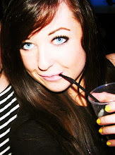
This is another one I want to use because of the floppy posture. It's different and quirky.

And this one too because it's different and characteristic and I think it would look good with the other two photos chosen.

For the second blend I'd like to use this one because it's simple and model-like, without looking boring and plain.

I like the natural feel of this one and how she isn't looking at the camera, so this is another I want to use for my second blend.

And lastly this one, because it's a bit different, a bit more quirky and lively and I think it'll work well with the other two photos!


Music Inspiration

I have put a 'mixpod' on the right side of my page which plays type of music that my magazine will evolve around. I have chosen a lot of female artists as my magazine is feminine and aimed at girls, and it brings more pop to the feel of it. The rest is mainly indie and alternative music and tends to focus on less mainstream bands than music in the charts (with a few exceptions e.g Lady GaGa, Tiao Cruz). Having thought properly about the type of music my magazine will be about, it helps me to concentrate on my theme and feel even more.