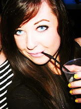
 This is exactly what I had in mind for my double page spread. It's simply laid out, not too busy, orderly and professional looking. The photos give it the quirky edge that's important in my magazine and the sections in the article make it look less like just big blocks of text. The only problem is the top right photo on the spread looks bigger than the other photos as it is more close up, so I might try experimenting with another photo there (although I love that photo ): ) and also changing the order of the photos to find out which looks best!
 In this version, I have changed the top right photo for another and I think this works better as it looks more continuous so I am happy with the result.
0 comments:
Post a Comment