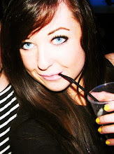

I chose this photo to experiment with first as it is one of my favourites and is quirky and fun, setting an appropriate feel for my magazine. I used a music stave behind my masthead to relate back to the fact it is a music magazine and to keep this clear. Each letter of the title is wonky and out of place, like notes on a stave and I think it looks quirky fun and original!
 I changed the font of the masthead to something less boring and something more characteristic and I love how this works because it's unusual and the way some of the letters are the wrong way around looks quirky. I added the text for my cover story on and I think it looks classy and quirky, a lot like this cover story technique.
I messed around with the fonts in this one and tried different ones, but I really like the ones used in the above photos so I think that I will stick to those. These covers remind me quite a lot of THESE sorts of covers from Lula magazine which was definately a look I liked and had got inspiration from.

Here I have tried adding some more wording onto the page to give it a little more body without making it look cluttered. I think it works nicely as it doesn't get in the way of anything, matches the other fonts and colours and gives a little more information to the magazine, drawing in the appropriate audience a little more.
0 comments:
Post a Comment