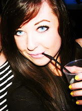

Because the blend of three needed a wider page, I thought I might have trouble with it fitting on a cover page and looking simplistic, so I tried the blend with two and I think it works better and I can imagine it being my cover with the masthead and cover story on it, so I think this is the way I'm going to do it.

I definately prefer the one above to this one, as the photos don't go together as well on this one and look more as if they have been cut out and slapped on.

I definately prefer the one above to this one, as the photos don't go together as well on this one and look more as if they have been cut out and slapped on.

0 comments:
Post a Comment