
I love how the colours in the coat turned out in this one because there is such a contrast between them. I cropped the edges of this shot and the ones similar but the others didn't work out as well because the colour didn't end up quite the same, and as I am looking to blend them together into the same picture, it would look odd. So I think the chances of me using these shots for my front cover are slim but I still have time to edit and play around to see what I can come up with.
 I LOVE this one because of the quirky pose, the way the colours are and the boldness of the shadows. The background is a pale pink colour which makes it look even more professional than having it white, and it works so well with the other colours in the photo. The photo reminds me of old retro photobooth photos, which was definately the kind of feel I wanted.
 Even as the original, this photo was my favourite and now I love it even more. The colours all compliment each other, I love the pose and the background and the shadows and I think it looks really professional.
 This photo is an example of one that didn't turn out as well. The model's face is more exposed than the rest of her and it looks yellow! Not good! Although it is a beautiful photo, I won't be using it in my final piece.
 This photo is really similar to the one above and this one looks a lot better because her face isn't yellow! I'm glad I decided to dress the model in black because it contrasts well with her blonde hair and red lips, and these sunglasses add to the classy look of this photo as they are black. Although I wanted quirky shots, these work nicely too because I want my magazine to be sophisticated and classic, and this is a classic style photo.
 I really like this because it is an amazing photo, and contrast works really well with the sunglasses and there is the boldness of the shadows again that I really like. The high contrast makes her hair shiny, with different tones, which I love as well.
 This one was one that I think i'd like to use for my contents page. Although the pose isn't fun and quirky, the way the crowns have been coloured against the black and white gives it the fun character that I wanted.
 I tried to edit the background in this photo and the lighting wasn't quite right as the face is more close up, and so took the impact of the flash from the rest of the photo. The background looked too dark when edited so I left it how it was and i'm pleased with the result. The black and white and colour adds more quirkiness to it and it looks unusual!
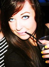
 This is a photo where I've incorporated the music theme as to not veer away from it, and I think with the editing, it looks unique and girly. I'm torn between this photo and another for one of the photos on my double page spread, but I should use this one as it keeps with the music theme.
 I'd rather use this one as it's a little more simplistic and I prefer the pose and it has more contrast in the editing. I may try and find a way of using the photo with the microphone somewhere else on the spread to keep the theme.
0 comments:
Post a Comment