
I love the simplicity of this cover and how the red background is part of the cover photo. It uses the three colour scheme (red, white and black) each colour bold and standing out against the other. The feature titles are fairly small but bold and don't get in the way of the cover shot.

This magazine cover is quite busy looking, with lots of features on the front and two mini photos. The colour scheme of dark blue, pink and white works especially well and doesn't clash with the cover photo as is it quite a simple photo. The features, quotes and photos are sort of wonky looking which makes it look like they have just been slapped on, giving it a casual and laid back look, relating to it's target audience.
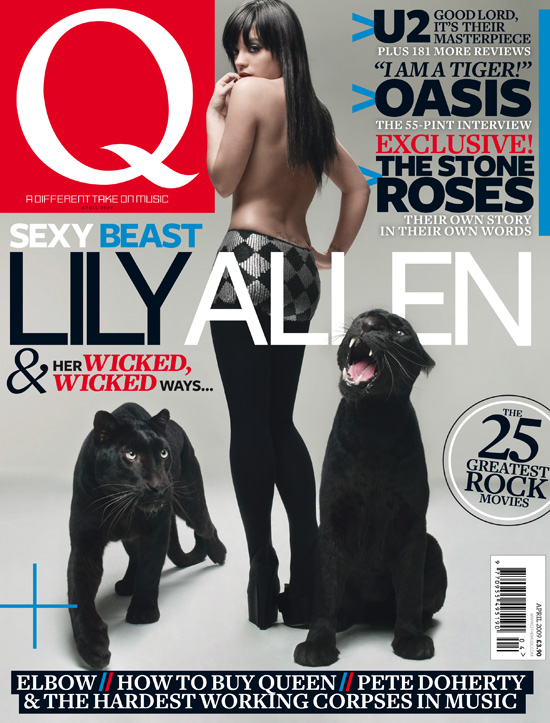
I like this magazine cover because of the simplicity of the cover photo and the page doesn't look too cluttered. It is set out orderly with the features at the top opposite the logo, and also at the bottom. I like the way certain words are made to stand out e.g 'wicked' in red. I don't like the colours used on this cover. They mainly use red, white, blue and black which breaks the three colour scheme and against the grey, it looks washed out.
0 comments:
Post a Comment